Iran proxy groups map work is no longer a niche intelligence exercise; it is now a practical baseline for anyone trying to interpret whether regional pressure is stabilizing or preparing for another escalation cycle. A useful map does not stop at plotting names. It links each node to what the group can actually do, where it can do it, and which logistics corridors make that behavior sustainable over weeks, not hours.
If you are following this topic in parallel with Proxy Escalation Ladder Middle East, US Troops in Middle East, and Strait of Hormuz Map, this page gives you the geographic operating picture that connects those pieces. Think of it as the map layer that sits under daily headlines and tells you whether new events are random, coordinated, or campaign-level.
What is an iran proxy groups map and why does it matter?
An iran proxy groups map is a structured model of actors, not a poster of logos. At minimum, each node should include five fields: operating area, preferred mission type, likely trigger events, known logistics depth, and escalation ceiling. Without that structure, analysts get trapped in a false binary where every attack is interpreted as either centrally directed or totally independent. In reality, behavior is often somewhere in between: aligned incentives, partial coordination, and variable autonomy by theater.
That distinction matters for three reasons. First, policy response windows are short. If a launch pattern in Iraq is likely to stay local, decision makers can prioritize force protection and deconfliction. If the same pattern appears simultaneously in Yemen and maritime lanes, the same event is no longer local; it may be a synchronized pressure campaign. Second, the market impact of proxy actions depends on where disruption occurs. A localized border strike does not move energy risk the same way sustained pressure on shipping chokepoints can. Third, public discourse compresses categories, which increases analytic error. A map with explicit threat typing is one of the fastest ways to restore precision.
Most importantly, a map gives you a repeatable baseline. You can compare this week to last week without rewriting your framework each time the news cycle shifts. That repeatability is what makes the page useful for operational teams, journalists, and readers who need to translate fast headlines into practical risk assumptions.
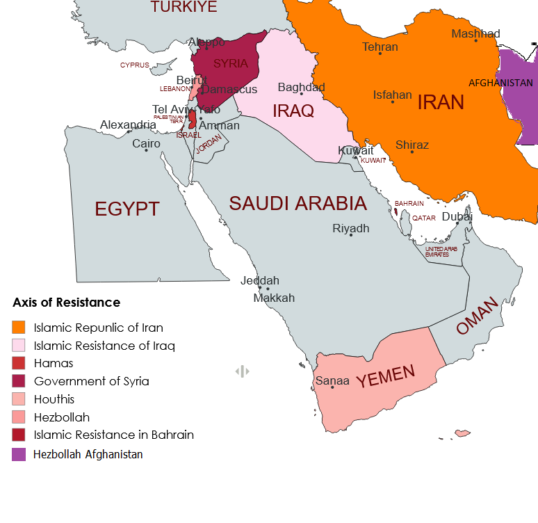
Which groups should be on the map in 2026?
A practical 2026 baseline usually starts with four core theaters. In Lebanon, Hezbollah remains the most mature long-range deterrent arm tied to Iranian strategic messaging. In Iraq and Syria, militia umbrellas and partner formations create a denser but more fragmented launch architecture, often focused on U.S. positions, logistics nodes, or symbolic retaliation. In Yemen, Houthi capability intersects directly with shipping security, which makes it disproportionately important for global market risk even when local battlefield conditions appear unchanged. In the Levant and Gaza-related fronts, additional allied actors create political and operational complexity, but their map value depends on what they can sustain, not what they announce.
When readers ask, "who are Iran-backed militias right now," the answer should never be a flat list. The same group can be high capability in one mission category and low capability in another. For example, a network that is effective in drone harassment may not be effective in sustained precision strikes. A map that labels only affiliation misses this entirely. The better model is to classify each node across mission bands: rocket and missile pressure, one-way drone harassment, maritime disruption, infrastructure intimidation, and political signaling operations.
Authoritative open-source references already support this approach. The Wilson Center's proxy documentation and map work gives actor-level context across multiple countries, while Washington Institute's interactive external operations repository adds temporal depth to how Iranian-linked operations have appeared across decades and regions. Used together, they support a layered map: current node geography on top of historical operational behavior.
| Theater | Representative Node Type | Primary Mission Profile | Escalation Signal |
|---|---|---|---|
| Lebanon | Hezbollah-aligned military wing | Rocket, missile, cross-border pressure | Range expansion plus launch persistence |
| Iraq/Syria corridor | Militia umbrella and partner formations | Drone and rocket harassment of bases | Multi-base strike cadence in 24-72 hours |
| Yemen / Red Sea | Houthi maritime strike architecture | Shipping disruption and route coercion | Insurance repricing plus reroute behavior |
| Levant / Gaza-related fronts | Partner militant networks | Political-military signaling pressure | Convergent messaging and simultaneous actions |
How do Iraq and Syria nodes shape U.S. base risk?
For U.S. force protection analysis, the Iraq-Syria belt is the most operationally sensitive part of the iran proxy network map. The issue is not only attack count. It is geographic concentration plus access to launch terrain, storage, and transfer corridors. When those conditions align, even low-cost systems can force high-cost defensive posture. This is why mapping in this theater should prioritize launch geometry and recovery windows instead of static order-of-battle labels.
Public reporting has repeatedly highlighted this risk profile. During peak cycles since late 2023, major wire reporting and U.S. official statements described more than 150 attacks against U.S. positions in Iraq and Syria. Whether a specific number changes by source and cutoff date, the map implication is consistent: base risk is chronic during escalation phases, and local pauses can reverse quickly if regional triggers change.
For readers using this page operationally, the key workflow is simple. Keep a base layer with fixed installations and known transit corridors. Overlay weekly incident points with three tags: weapon class, claimed attribution, and observed damage pattern. Then add a fourth tag for strategic context, such as a high-visibility strike elsewhere in the region. Over time, you will see whether incidents are opportunistic noise or part of a synchronized pressure wave.
How does the map connect to maritime and energy risk?
Many readers treat proxy mapping and shipping mapping as separate tasks. They should not. The same network logic that explains land-based pressure also explains maritime risk transmission. Groups do not need to permanently close a chokepoint to create global impact; they only need to generate enough uncertainty that operators reroute, insurers reprice, and cargo timing slips into a tighter window. In practice, that is often enough to shift freight economics and feed broader energy volatility.
This is where node placement matters. A map that includes Yemen and the Hormuz corridor can show whether disruption is likely to remain one-theater or become dual-theater stress. Dual-theater stress is materially different because rerouting options compress. If one lane is pressured and the other is uncertain, shipping planners face a narrower set of feasible routes and less schedule flexibility. That is when war-risk premiums and charter behavior become leading indicators, not trailing indicators.
To translate that into actionable monitoring, pair this page with Persian Gulf Map, Gulf of Oman Map, and Strait of Hormuz War Risk Insurance. The geographic pages show where exposure accumulates; the insurance page shows when that exposure has been priced into real-world shipping decisions.
What command-and-control patterns actually appear in open sources?
A recurring analytical mistake is assuming perfect hierarchy. Open sources suggest a more mixed pattern: shared strategic alignment, uneven operational control, and theater-specific autonomy. That means map interpretation should rely on behavior clusters rather than assumptions of direct command in every incident. If two theaters escalate simultaneously but with different weapon classes and distinct messaging, you may be seeing coordinated signaling but not identical tasking.
In practical terms, command-and-control inference should use three categories. Category one is tightly coordinated behavior: synchronized actions, similar timing windows, and convergent public framing. Category two is alignment without synchronization: actors move in the same political direction but on different clocks. Category three is opportunistic attachment: local actors leverage regional tension to pursue local goals while still invoking broader alliance language. Your map should annotate which category each burst most likely fits and revise only when new evidence appears.
This is where a timeline archive is critical. Without chronology, analysts overfit the newest incident. Use Live Iran War Timeline Archive as the temporal layer and this map as the spatial layer. Combined, they prevent common errors such as reading a tactical spike as strategic regime change or ignoring slow-burn buildup because no single incident looked dramatic.
How to score proxy groups by threat type instead of headline volume
Headline volume is a weak proxy for real risk. A better approach is to assign each node a weighted threat profile across mission classes. The profile should include capability confidence, access confidence, and sustainment confidence. Capability asks whether the group has demonstrated the toolset. Access asks whether it can place effects in the target area. Sustainment asks whether it can repeat activity beyond a single burst. A node with moderate capability but high sustainment can be more important than a high-capability node that fires rarely.
You can implement this with a 1-5 scoring system and a simple weighted composite. For example, maritime disruption risk might weight access and sustainment more heavily than raw payload size. Base harassment risk might weight launch density and proximity. Infrastructure coercion risk might weight targeting discipline and repeatability. The point is not mathematical perfection. The point is consistency across update cycles so you can compare like with like.
| Threat Class | Primary Variables | Suggested Weighting | Operational Use |
|---|---|---|---|
| Base Harassment | Launch proximity, cadence, survivability | 40/35/25 | Force protection posture and alert windows |
| Maritime Disruption | Corridor access, persistence, incident clustering | 30/40/30 | Route choice, insurance planning, convoy timing |
| Strategic Signaling | Target symbolism, message coherence, tempo shifts | 35/30/35 | Escalation branch selection and diplomacy timing |
| Infrastructure Pressure | Precision, repeatability, recovery lag impact | 40/30/30 | Civil resilience and economic shock modeling |
What early-warning indicators should you watch daily?
A decision-grade iran proxy groups map needs a short, disciplined indicator list. Track too few and you miss transitions; track too many and you lose signal-to-noise. For most teams, ten indicators are enough: cross-theater incident count, launch range changes, maritime incidents near chokepoints, insurance premium behavior, reroute announcements, propaganda synchronization, target-category shifts, logistics interdiction reports, defense interception strain, and diplomatic deconfliction traffic.
The critical concept is indicator coupling. One indicator moving is usually noise. Three moving together is often a regime change. For example, if incident count rises but target categories stay symbolic, risk may remain bounded. If incident count rises, target categories harden, and shipping-risk pricing jumps in the same 48-hour window, you are likely entering a higher escalation branch. This is exactly the kind of pattern recognition a map supports when each incident is geotagged and timestamped instead of summarized as one-line text.
Finally, define a no-action zone. Not every uptick should trigger public claims or policy shifts. A no-action zone might be a 72-hour window where indicators are watched but thresholds are not crossed. This protects against overreaction during noisy cycles and keeps analysis tied to evidence.
How to use this map with other Iran War Log pages
This page is designed as a connector asset inside the site's internal graph. Start with this map when your question is "who can act where," then branch by mission type. For military pressure against U.S. assets, move to US Troops in Middle East and Iran Missile Attack Risk Index. For deniable escalation logic, use Proxy Escalation Ladder Middle East. For shipping and energy consequences, pivot to Strait of Hormuz News: Shipping Freeze and Will Iran War Raise Gas Prices?.
That linking pattern is intentional for both readers and search crawlers. It prevents thin topical overlap by giving each page a different analytical job: spatial map, temporal archive, capability model, or market impact explainer. When each page has a distinct role, internal links increase clarity instead of cannibalizing intent.
If you are maintaining your own monitoring workflow, mirror this same structure: one page for actors and geography, one for chronology, one for scenario thresholds, and one for downstream economic effects. The benefit is speed. You can update one layer without rewriting all others, and still retain a coherent whole.
Bottom line: what the iran proxy groups map should tell you fast
The core value of an iran proxy groups map is fast discrimination between noise and transition. It should tell you, in minutes, whether current activity is geographically isolated or cross-theater, whether mission types are stable or intensifying, and whether logistics depth supports continued pressure. If those answers are unclear, the map is decorative, not analytical.
A good map also improves communication discipline. Instead of saying "the region is escalating," you can state what changed: launch geography widened, maritime pressure persisted, and target categories hardened. Those are testable claims that can be revised transparently as evidence changes.
In 2026, that discipline matters more than headline velocity. The network is adaptive, the theaters are connected, and the cost of misclassification is high. Keep the map structured, keep the indicators explicit, and keep updates tied to observed behavior rather than narrative momentum.
FAQ: Iran proxy groups map
What is an iran proxy groups map?
An iran proxy groups map is an operating picture that links armed groups to geography, logistics, and mission type. It works best when each marker is tied to observed behavior such as drone launches, rocket pressure, or maritime incidents.
Which Iran-backed groups are active in Iraq, Syria, Lebanon, and Yemen?
The core structure includes Hezbollah in Lebanon, militia umbrellas in Iraq and Syria, and Houthi forces in Yemen, with additional aligned actors across nearby fronts. The exact threat level depends on mission class and sustainment, not just group name.
Do Iran proxy groups directly threaten U.S. bases?
Yes. Open-source reporting and official statements have repeatedly documented attacks against U.S. positions in Iraq and Syria during high-tension cycles. The map value is identifying when those incidents remain local versus part of broader synchronized pressure.
How can analysts tell when proxy activity is escalating?
Escalation is usually visible when tempo, range, and target category shift together over a short window. One incident is noise; repeated cross-theater movement is a stronger signal that branch risk is rising.
What indicators matter most for shipping and energy risk?
Track maritime incident clustering, war-risk insurance repricing, rerouting behavior, and sustained pressure near chokepoints. These indicators often move before broader market narratives catch up.
External references: Wilson Center proxy profiles, Washington Institute operations map, AP reporting on attacks against U.S. positions, U.S. EIA Hormuz analysis.